Of pirate TVs and golden walls
After 25 years in the business, it was time for a refresh. This also applies to our logo and its use. Old proven elements, such as our color palette, remain the same and are only reinterpreted and expanded.
With our classic logo, the pirate TV with PIRATES ’N PARADISE below it, there were always problems with the representation. Especially in the context of other logos, the PIRATES ’N PARADISE logo was often too small or simply got lost. In the future, the figurative representation of the monster TV should no longer be the focus, but rather the name PIRATES ’N PARADISE. This now uses a clear uppercase font. The logo is completed by elements of the monster TV, namely the sword and the eye area with eye patch.
These elements allow for a very high recognition value, even with different arrangements of the logo elements.
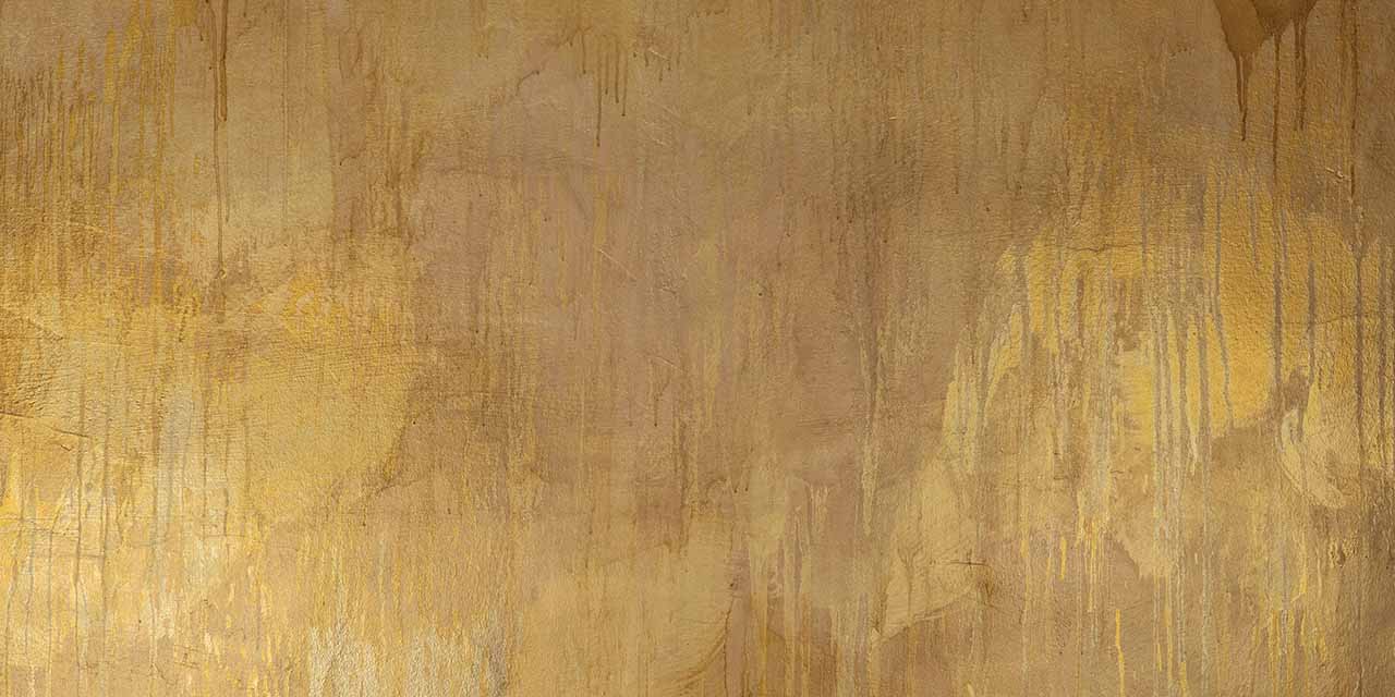
In addition to the logo, interrupted line strands in gold are used, which, in addition to a decorative use, provide playful assistance in designing for online media and other marketing purposes. Due to their interruptions, they are intended to evoke digital signals that spread in all imaginable and possible, as well as partly impossible dimensions – the challenges we deal with every day. Fun fact: the filling of the lines consists of a photo of the wall designed by an artist in the reception area in Düsseldorf’s Adersstr.
But of course, we don’t let a corporate identity (CI) chain us down. Even after 25 years, we are still young and want to continue experimenting with our logo, colors, and our existence.
We are pirates – we may do that.